National Digital Forum (NDF) Conference 2019
November 19-20, 2019
Te Papa Tongarewa (Wellington, New Zealand)
The 2019 NDF conference was another two days full of ideas, inspiration, challenges, and network building. The four keynote presentations were stellar as usual and provided a lot of things to think about, ranging from creating new and beautiful data visualizations, facilitating more diverse perspectives on Wikipedia, cracking the patriarchy by getting men to work with others who don’t look and sound like them on media projects, and empowering people with data about the health of their homes to prevent illness and death. The other sessions offered useful information and ideas for how to educate and engage audiences in the Galleries, Libraries, Archives, and Museums (GLAM) sector. The conference hashtag was #NDFNZ and videos of the sessions are available on NDF’s YouTube channel.
Day 1 – November 19, 2019
Keynote: We Are Here – Chris McDowall and Tim Denee (away)
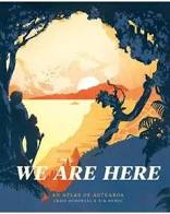
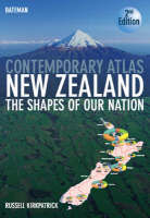
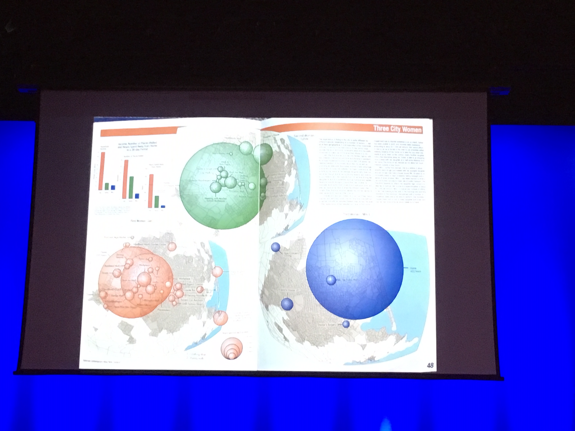
The conference began with a keynote by Chris McDowall, co-author of We Are Here, an amazing book of data visualizations using New Zealand data. He completed his PhD on data structure and calls himself a geographer to make it easier to describe to people what he does, and he said he wanted to show us what goes on in his head as a geographer in mediating between technology and observation. In showing the audience some maps, he acknowledged that there are problems with maps, such as that they enable states and corporations to exert power at a distance. Yet there is good in these technologies and some things that can only be said through maps. He showed some examples from a predecessor book, Contemporary Atlas New Zealand: The Shapes of Our Nation by Russell Kirkpatrick, that shows the activities of three women; the one on the left is someone who gets out and moves around town a lot, while the one on the right is a widow who is largely homebound. This is a way of visualizing data that can lead to other analysis and thought about what is occurring in society.
He showed the visualization of New Zealand music like a river that was very cool. He used Discogs API and built a spider program, and also relied on AudioCulture (“The noisy library of NZ music”) for information. He and Gareth Shute, a music historian, spent many hours reading all the musician biographies on Audioculture, on Wikipedia, on their own websites, and then putting dates and key info in a spreadsheet.
There were various interstitial essays in his book, and he encouraged writers to set their own tone; interestingly, about half looked at drafts of content beforehand but the other half didn’t and had to write just based on conversation about the content in general. At the last minute, a friend told them they should go with a matte page rather than glossy, because too much reflective light would exhaust the reader, and he is glad they went with matte for the book in the end. In terms of gathering feedback throughout the book-making, he discovered that he would receive less and feedback because people were busy, so he worked in isolation for too long before realizing that he needed feedback from people. So he changed his strategy and invited people over for a drink to get feedback without any other commitment needed and found this worked better than relying on emails.
He discussed the debate between having place names on maps or removing them. Getting rid of place names can allow the reader to see coastlines and discover mountains, etc. for themselves and let maps stand more as artistic on their own, so they are not always needed or wanted. What he wanted overall was for maps to be for everyone, so they couldn’t require him to be there to explain them. There’s an emotional dimension to trying to understand something that is opaque or hard, and he said he sometimes forgets how non-cartographers can find a map is ‘not for them’ and turn the page. He didn’t want that to be readers’ experience with this book. Along with that thinking, sometimes putting in something that’s obvious is important, and he gave the example of the icons/silhouettes of birds in one section. They let readers jump into each map without having to decode and avoid the need for legends, which are good for reference maps but not for visualizations like in his book.
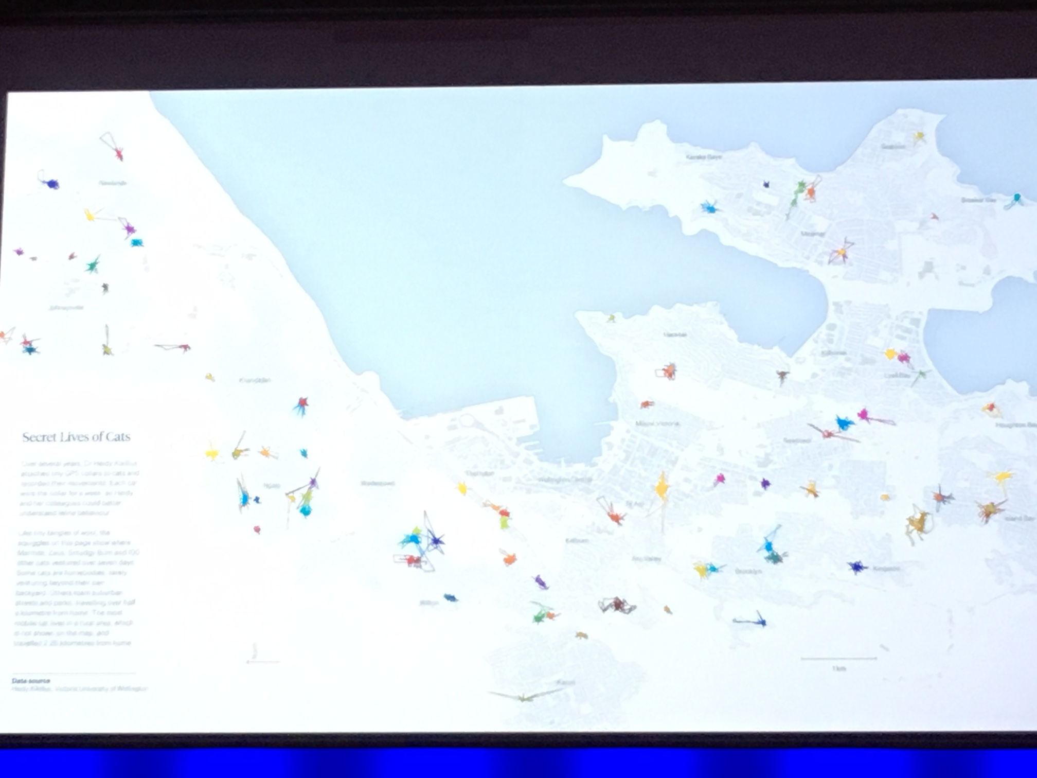
He talked about trying to find the balance in political issues and that putting the pages next to each other on birdlife and then predators like stoats and cats was one of the few minor editorializing instances. The page turning effect doesn’t seem to be able to be replicated in digital, but in print, the reader can proceed from a page on birds to one on rats and then one on the Secret Lives of Cats, which shows where a group of cats in Wellington travelled through tracking devices, and this can create different emotions in the reader as they see the relationship between bird populations, for example, and the number of other animals. He said some people are delighted by the page on the Secret Lives of Cats, and think thought like oh, where’s my cat, but others are disturbed.
He wants the book to be a point of conversation and dialogue and for lots of people to read it.
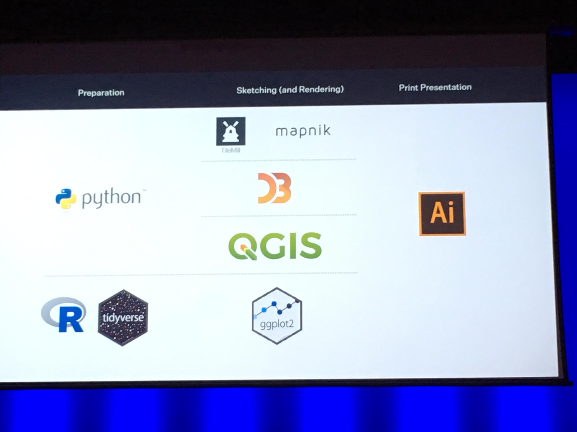
There was another point about with data, not losing the trees for the forest sometimes. His example was when looking at data in Digital NZ API and finding a photo with the tags ‘Maori’, ‘horse’, ‘woman’, trying to visualize that didn’t do the photo or the data justice. Sometimes we need to see the photo for what’s important. They were able to make the book with data that was all open except for two datasets, and they used all open source software except Adobe Illustrator. They released the programming code on Github.
A Pacific Virtual Museum: Connecting device and dispersed people with taonga – Mark Crookston
Crookston discussed the Pacific Virtual Museum multi-year pilot project that is starting now and attempting to make connections via a virtual museum (see also the Pacific Libraries Network). An interesting and relevant fact is that although there are 8% Pacific people in New Zealand, they make up 36% of youth.
Keeping time: Digital dance archive adventures in North America – Rebecca Galloway
Galloway discussed her experience being at the Jacob’s Pillow dance festival in Massachusetts for nine months about a decade ago. In looking to create a website to showcase dance, Director of Preservation Norton Owen thought people would rather see a hint of something that intrigues them than whole videos, so this informed the development of the project. They wanted to consider the joy of use (a la Marie Kondo), not just ease of use. The site can be considered to fall into edutainment and is a type of online museum for the dance world. It has been called “irresistible” by the Washington Post. She liked the quote from an unknown source about how the digital world has thrust us into a world of perpetual migration. Something interesting about user design was that in Canada, everyone knows a French version of something will be 25% longer than English, so UX people know to consider this. This kind of design knowledge needs to be transferred to a NZ context.
Regional ambassador showcase – Jennifer Taylor Moore and Tim Jones
They noted some of the highlights, issues, and questions raised at the NDF regional forums, including things like the issue of a lack of IT support or infrastructure at smaller sites. Questions to consider going forward include: Is NDF a training provider? Could it be? Should it be? What would a business model look like? Are there training needs that are the same over time? Do people get unconferenced out? Is networking valuable in itself?
John Mawurndjul – Jean-Pierre Chabrol and Jazz Money
Chabrol and Money are from the Museum of Contemporary Art in Sydney and discussed the John Mawurndjul exhibit “I am the old and the new”, which came from a quote from the artist himself. There are over 250 independent Aboriginal groups and Torres Strait Islanders in Australia and 600 dialects, so it is not like New Zealand in terms of the ability to have things be bilingual in a straightforward way. There was a challenge in working with a contemporary artist who is internationally known and had two shows in Europe but is not a known name in Australia. The exhibit was bilingual, which was big for Australia, and the linguistic area is one of most linguistically complex places on Earth. They did their best to provide a type of ‘indigenous level of safety’ for the artist by doing specific things like recording him in his language and ensuring that all of the digital resources belong to him and his community. In addition, everything was directed by the artist, which sadly is not common for indigenous artists in Australia.
Bringing archives alive: Using tech to tell the stories of the past – Alison Breese
Breese is an archivist at the Dunedin City Council and recently finished a postgraduate degree on public toilets in Dunedin that has received press coverage (Otago Daily Times article; Stuff article). She wanted to use VR to make a tour of underground toilets, but this process was cumbersome and only one person could do it at a time. 3rd-year IT students from Otago Polytechnic were enlisted to create an app to do a similar thing, and photogrammetry (stitching images together) was used to stitch hundreds of images together to create a virtual model of the space.
Raranga Matihiko – Weaving digital futures – Tara Fagan
This programme at Te Papa with other partners aimed to create an “education innovation” learning environment targeted at youth who don’t go to traditional GLAM sites like a museum. It wasn’t about turning them into coders but showing them how to use tech for meaningful things. There were 16 hours of contact between students and facilitators, and the programme connected young people with museums in a way that they could combine social experiences and technology. Some hadn’t ever been into Wellington city, even if they lived a short distance away, or hadn’t ridden an elevator so found the experience completely novel. There was a principle of ako underpinning it: everyone is a teacher and a learner. The students gained digital citizen and fluency skills as well as learning about digital museums and access (e.g. copyright issues). They also weren’t forced to use tech all the time; they could choose to use pen and paper or different types of tech. Students learned about possible career paths in cultural heritage (“Do you mean I could work here and care for our taonga?” “Yes!”), and everything was open source so students could use elsewhere if they had internet access. It strengthened students’ self-esteem (having the two facilitators helped) and another good result was that students were returning to the museum with their family on the weekends. Fagan showed a video of the virtual whare with a voice-over by Year 9 students, who used Tilt Brush by Google and Kapwing.
CSI: Pukekawa – Digital and natural experiences in the Auckland Domain – Ruby Moore and Tom Rowlands
Moore is Land Fauna Collections Manager at Auckland Museum, and Rowlands is Learning Specialist there. They mentioned projects like Bioblitz, a 24-hour survey of biodiversity that is a big public engagement event; bird studies that have found more tui in the city; and iNaturalist – Auckland Domain Project that is online citizen science that is open and available to anyone with a device. The latter creates another connection between museum staff and the public and teaches people to record important collection information. There is a remnant patch of forest in the Auckland Domain, next to the Auckland Museum, and this was used for the CSI: Pukekawa education programme (CSI standing for Citizen Science Investigations). It enables student agency and has students doing science and engaging with scientists, it complements the new digital curriculum, and it shows the potential for collaboration between nature and digital rather than competition between them. They teach students to be digitally responsible when uploading content to the iNaturalist site, and that people from all over the world can see their photo uploads (e.g. please don’t post a photo of a taxidermied penguin or Kit Harrington from Game of Thrones). An interesting observation from Moore was that her expertise was considered more legitimate by one student after it went online. She explained, “I became more real when I went through a digital medium” and that one student was only half listening to her explanation about a specimen until she uploaded it online and once he saw it there, he lit up and said “Oh, it’s a such-and-such”.
Museum in a box: Curiosity machines – Mandy Herrick and Tom Rowlands
They took as their challenge: how to marry 3-D objects from museums to a story or stories, and their question: how can we blow the minds of these young children? They used three components: NFC stickers, an NFC reader, and a Raspberry Pi computer. NFC uses the same technology as Snapper or transport cards and is increasingly being used in the museum environment (see The Wonderland coming to Te Papa). They interviewed youth to find out what they already know about the collection, and they thought there were 50 to 201 objects in safekeeping (when actually there are 1.5 million natural history objects and 200,000 human history artifacts, i.e. a lot more!). They decided to use the Museum in a Box created by a London-based company that was piloting them with 40 GLAM institutions around the world. This offers a layered self-guided participatory experience, akin to a micro museum. One significant question was: who would be the narrator/voice for the box? Another project in Capetown used Zulu elders to narrate.
One teacher interviewed liked that students had to use a different sense (auditory), had to listen to find out more. She suggested having an object that relates to students’ culture and country that could be really special, which sounded like an advanced version of the classic ‘show and tell’ activity. This project provided more reach than a traditional museum exhibition. Students loved the tech and hearing from experts, and bringing many voices into classroom could reduce the boredom with having just one teacher’s voice all the time. They suggested it can help to prime students beforehand but this is not essential; in a funny case, one teacher just left the box in classroom for a week and an ambitious and curious student emailed the email address on Rowlands’ business card on the box with lots of questions about what the box was, signalling that this was indeed a curiosity machine for youth.
Where are all the spotted shags? – Guy Annan
This project was about the creation of 3D printed spotted shags and fake poo that were put out in the wild to try to encourage birds to create a colony (RNZ article).
So…what’s the easiest way to process these 352 CD-ROMs? – Flora Feltham
This project was part of an R&D idea to compare two different machines that purported to be able to process CDs faster and more efficiently than human workers could (since this is quite manually intensive normally). It raised the question going forward: how are we going to change archival processes to deal with digital material? In the end, it was determined that the Acronova Nimbie USB Plus worked better than other machine though wasn’t perfect.
Bots I have met – Paul Rowe
The simple yet clever title of Rowe’s presentation foreshadowed a quick preview of bots being used in today’s world and the overriding notion that the more accessible and open content is, the more likely it is to be seen. Rowe first made a paper-based analogy, saying that the first ‘bot’ he encountered was actually a choose-your-own-adventure book that takes you to different places based on your choices. Auckland Art Gallery’s chat bot provides users with things like opening hours, what’s on, and access to the online collection if you ask it something like “send me cake”. It was built using the Facebook Messenger app. There are Twitter bots that can share content from a collection, like tweeting artworks several times a day. The Smithsonian’s humanoid robot, Pepper, is a possible worry in that we’re getting closer to uncanny valley. There are out of the box solutions like Chatfuel and Botsify.
The exhibition closes but the digital offspring lives on – Rachel Bush
Bush discussed how reusing exhibitions helps make the large costs for them more worth it. For example, the butterfly exhibit has been reused elsewhere. She said we need to think of new ways to reach audiences and keep exhibitions alive.
What were you using NZ Museums for today? Digging into user survey results – Emma Philpott
A Hotjar pop-up box on NZmuseums asks users “What were you using NZ Museums for today?” and has gathered 1,600 responses so far. They also have information from Google Analytics, but this wasn’t telling them what people were really doing on the site. They have fortunately received few negative responses (‘none of your business’), but some people have used the box to ask questions but haven’t provided contact details so there’s no way to actually respond to them. She encouraged the audience to ask visitors what they’re doing on your website if you’re not already.
The National Library and digital storage – Cynthia Wu
Wu discussed a new storage platform and two data centres in Wellington and Auckland that now provide geographic redundancy.
Creative Commons copyright licensing explained – Victoria Leachman (away) presented by Catriona McPherson
This presentation provided a helpful overview of Creative Commons licenses, which are kind of like a pre-approval. The analogy of a buss pass was used: just as you don’t travel on a bus without your pass, licenses need to travel with the work they belong to. This can take the form of a credit line, icons, or a list at the end of a presentation. The CC0 one means the author is waiving all rights now and in the future, making it for public domain. Note that you can’t put licenses on a public domain work, which some GLAM places are doing. Also, just because you own the physical work, doesn’t mean you own the copyright.
Possible futures from the present margins: Decolonizing knowledge, decolonizing the internet – Adele Vrana and Anasuya Sengupta
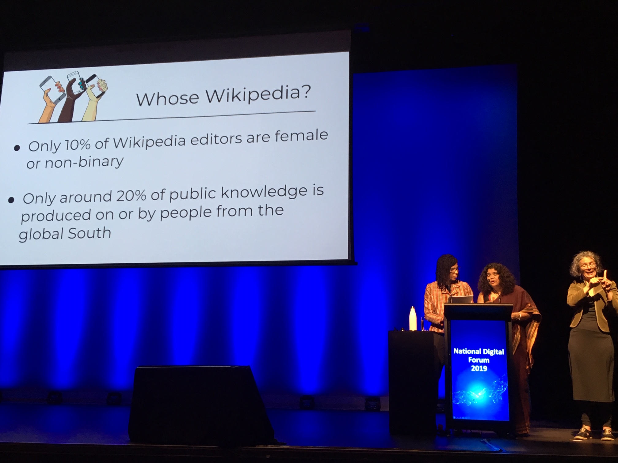
This keynote by Vrana and Sengupta from Whose Knowledge? really needs to be seen and heard to be fully appreciated, as they wove facts and stories and struggles and highlights to provide a sobering look at the need to decolonize knowledge and the internet, with a focus on Wikipedia. Originally from Brazil and India, they now live in the US and UK and soon discovered what it was like to be present in a room and yet completely invisible. They are now putting technology into feminist organizing and feminist organizing into technology. They had some audience participation, asking us to chat with a neighbor about what we thought of when we saw these words:
- Printing press
- University
- California Gold Rush
As expected, they said what many people think of is just one perspective or even not accurate. The printing press had origins in China, Japan, and Korea; the first university was founded in Morocco in 859 CE by Fatima al-Fihri; and the California Gold Rush involved the systemic genocide of Native Americans. But in the Wikipedia article for the gold rush, for example, there is a white settler perspective that barely mentions Native Americans.
They gave a disclaimer saying they know there are Wikipedians who are passionate about the potentialities of the site, but that we need to consider whose knowledge does this site hold? It is default, go-to place for information, including things related to cultural heritage, but it prioritizes only certain knowledge. Only a fraction of human knowledge is represented in books; most is embodied, experiential, oral, auditory, etc. They asked, what might oral knowledge mean for Wikipedia? Connecting with McDowall’s earlier caveat about the problematic nature of maps, they talked about how maps are arguments.

They discussed the difference between embodied (tacit) knowledge and disembodied (formal) knowledge; when you make embodied knowledge visible/recorded, it becomes disembodied and formal, e.g. a dancer performing on stage versus being recorded or interviewed talking about their performance. The information on Wikipedia is amplified by Google, as are the gaps and silences, and we are still living in the shadow of the Enlightenment.
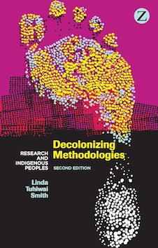
They drew on ideas from Decolonizing Methodologies by Linda Tuhiwai Smith, who says that colonizers are okay with taking knowledge from the colonized but then reject the people who created it. They asked, what might a decolonized internet look like? The conversation is very different with women and people of color in the room than it is when there is a mainly white, mainly male, Silicon Valley crowd. Settler colonialism continues online. They said to look out for the State of the Internet’s Languages Report coming out next year and check out the feminist organization, the Association for Progressive Communications.
In looking at education, they said that instead of their students writing papers, they like to do something that goes in online space, but they are warned that they have to be careful as marginalized people not to marginalize others.
They mentioned radical non-institutional GLAM sites like the People’s Archive of Rural India. They recognize deep knowledges have been brutally extracted and abused so respect the rights for people to hold knowledge and choose to become open. They said they ask these questions as we dream of possible futures from the margins and beyond:
- How have I benefited from colonization, racims, or the comfort of the status quo?
- What from my own past do I choose to carry forward, and what should I let die?
- Whose knowledge is still missing, and how can I support and honor the people who best hold these knowledges?

There is talk of the digital divide, but offline and online are not a binary but a continuum. Often being online is seen as a binary – you are or you aren’t, but for many in the world the internet is not Firefox or Chrome, it is a smartphone, Facebook, or messaging apps (e.g. Malaysia has the most messaging apps in the world). Many of the elders feel inadequate with digital technology, while young people are comfortably online.
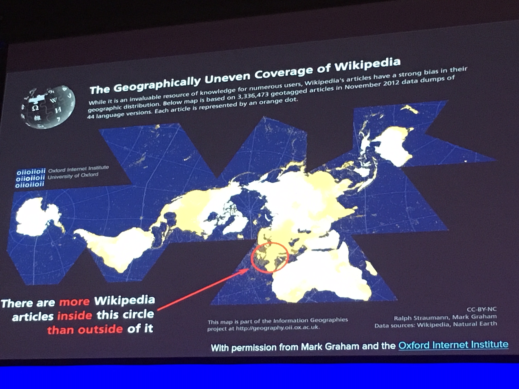
They said discomfort has to be a second skin. If we are the designers of these technologies, we don’t have to trust others; we need to be at the table and behind the computer, coding and creating. It’s time to stop being the end user and be the producer. Yet in the case of Wikipedia, you need access to resources and a computer and leisure to be a Wikipedian, and who gets leisure? Another issue is that you need skills of argumentation if you get reverted or challenged, and not everyone has these or is able to use them on the site. They advised finding a Wikipedian to have in your pocket if you don’t like arguing but have expertise. There are more articles on Wikipedia on Antarctica than on Africa, and one of their articles was speedy-deleted five minutes after creation despite having 11 references, showing the kind of obstacles that one can face.
They addressed that we live in a world where we’re complicit with capitalism; they said that they’re on Facebook because that’s where their communities are, and Facebook’s language rendering is really good. The difference between tech capitalism and regular financial capitalism seems to be that with tech capitalism, there is a God complex, unlike with financial capitalism, which is focused on profit. Mark Zuckerberg thinks he’s making the world a better place through Facebook.
They said that they speak about Wikipedia with tough love is because if you want to have your small community known about, you have to get it up on Wikipedia. Otherwise, someone would have to visit you to learn about it, which isn’t practical.
They closed the Q&A time by saying that they’d be up for an impromptu edit-a-thon, which was then scheduled to take place the following day during lunchtime for those who were interested.
Day 2 – November 20, 2019
Keynote: Making sense of the unfathomable: Digital Humanities for desperate times – Deb Verhoeven
Verhoeven’s keynote continued the themes of feminist and decolonization criticism of the previous day, taking it to technological infrastructure and the film industry that she studies. Some challenging concepts include: How do we get ourselves out of our heads? How do we make connections based on ideas of people we don’t already know or who aren’t mirrors of ourselves? She discussed how we are living in a world of devastating and widening division; we are living in a closing-down world (examples include: build a wall and incarcerate people on islands, including children). To address this, we need to foster inclusion and connectivity. And these issues impact how we handle data and infrastructure. All infrastructure enables connections—that’s what it does—but it is largely built for us by engineers.
She linked the discussion on infrastructure to the 16th century discovery and navigation era by the Dutch, among others, and the terms and metaphors that we still use that come from imperialism times. The questions they would ask that we can also ask regarding our infrastructure are:
- Where am I now?
- Where am I going? (in the example of a link, you don’t really know where it is taking you when you click on it)
- What is my speed?
- What is my depth? What lies beneath my feet? (fathom) (this is not being done very well with digital infrastructure)
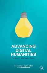
She mentioned the Advancing Digital Humanities: Research, Methods, Theory book and that we want to see traditional values of humanities flow through the Digital Humanities. She spoke of her work with Huni (Humanities Networked Infrastructure) and how the needs of humanities scholars differ from what is traditionally possible in digital infrastructure. For example, one can’t resist or contest in most digital infrastructures; also, the ability to say NOT (this is not related to this other thing) is incredibly valuable to humanities researchers.
She then discussed her work on the Kinomatics Project, which collects and analyzes data on the creative industries. In regards to Big Data, which is often thrown around, she said if your data hasn’t caused you to have an existential crisis, it’s probably not Big Data; if it hasn’t caused you to rethink how you see things, it’s probably not Big Data. For her, Big Data has been a revelation.
Next, she showed an (unfinished) painting by Turner of a shipwreck of female convicts and children who drowned on the way to Australia (A Disaster at Sea c. 1835); Turner is asking us – Are we just spectators? Do we turn away from it or just theorize it? She discussed the plimsoll line, the loading limit line for ships, as a very creative metaphor and asked: Does patriarchy have a plimsoll line? How do we sink the S.S. Patriarchy?
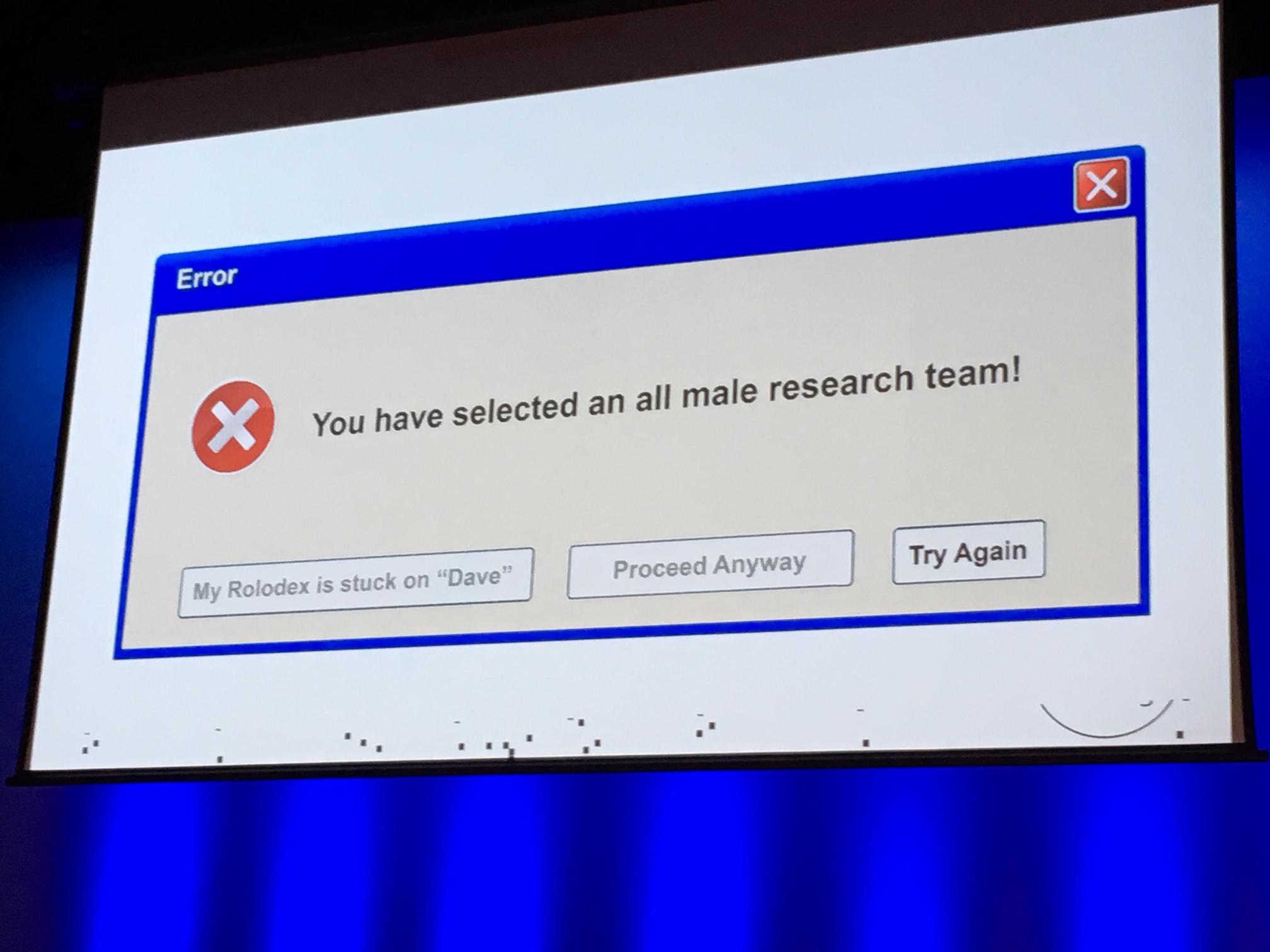
She showed the data on women in the film industry in Australia and said in 30 years the data had gotten worse, and that continuing to show women this data may keep them from believing they can ever be a part of the media industry. She showed network graphs and explained how the problem is that there are so many men who don’t/won’t work with women. When she asked what if we stopped funding these men who don’t work with women, the audience clapped. She said we might think that patriarchy looks like male political leaders like presidents and prime ministers, but it actually looks like a network of men who only work with other men. This visualization is a way of seeing the contours of injustice in a new and different way. Then she brought in some stats on how many Davids/Daves there are in comparison to the number of women and humorously said that we don’t have a ‘diversity’ problem, we have a ‘Daversity’ problem. Then everyone was asked to sing along to the chorus of the song “The Daves I Know”.
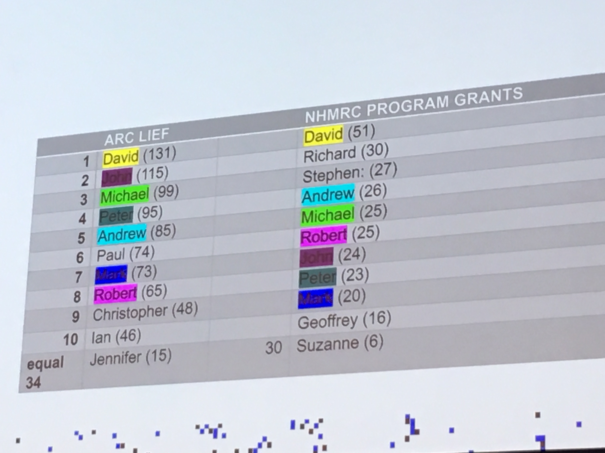
Even if all of the ‘gender offenders’ were taken out of the network, it wouldn’t solve the issue; one would have to take all men out for it to work. This means the only solution is for people in power to collaborate with people who don’t look or sound like them, and their team has modelled it in the Workplace Inclusion Diversity and Gender Equity Tool (WIDGET).
Keynote: Why ‘why’ matters – Hīria Te Rangi
Hīria Te Rangi gave a stunning keynote on her story and her work with Whare Haurora, which develops sensors for homes to tell family members if their home is making them sick. For example, she said the sensor in the home with elderly people would be registering 9 to 13 degrees when it was almost the same outside, meaning that the house was only adding about 3 degrees of warmth, and the WHO recommendations for kaumatua or an elderly person is 21 degrees. She said we are a developed nation, yet pneumonia/respiratory illnesses are taking out people before it should be their time. A free insulation project was cancelled by the last government, even though it was successful. 60% humidity is a problem, and living in cold, damp housing is linked with anxiety and depression.

She explained how Whare Haurora was created by a bunch of nerdy ladies, who started with a prototype sensor that cost $30 and assembled the parts on kitchen tables. She eventually went to China to get manufacturing sorted. The idea is that their kits can be moved to another home once it is insulated. Every 10 minutes data is sent from the sensors in the home, and they wanted to make it accessible via PWA (Progressive Web App) offline since not all families have enough data to be constantly connected. One issue is that just showing people a jumble of numbers doesn’t work since it doesn’t mean anything to them; you have to tell people what it means for them and their health in an accessible way. You also have to explain how the device works and show them to alleviate concerns. The organization ensures that the whanau owns all the data and it just provides the service. This aspect is an example of the need for indigenous organizations like hers, to get things done with values intact, especially if the government isn’t doing it. The data at the aggregate level can be used for nationwide benchmarking and to predict respiratory disease, but they are careful as to how data is used and have their own ethics committee toward this end. Her determination to do something about a pressing societal issue was very inspiring and illustrated how technology can be used in a very practical way to empower communities without compromising values.
A regional approach to collections: ‘It’s all about the baking’ – David Luoni, Rosemary Jackson-Hunter, Tiffany Jenks
Project Ark in Southland was discussed as an example of how they helped put objects from a dozen of the museums in the region online and guided volunteers to be a part of the process in a meaningful way. One example was Mataura Museum, a small, 50 square-metre museum run by a group of women they affectionately called the grandmothers. They wanted to provide support for aging, volunteer-led teams and those who aren’t ‘digital natives’, and they know that just coming in for a week or providing a user guide is often not enough. This pilot is being helped by the fact that there is a regional heritage rate in Southland ($35 + GST a year) that can fund projects like these. Each organization picked 50 objects to share online via eHive, which made it equal for everyone. When provenance and record-keeping were patchy for an object, this project helped rectify that and show what was in a museum’s collection. They described helping volunteers by starting with tiny baby steps and were happy to find that within a fortnight, people were feeling more confident and had the hang of it and were even teaching others. They believe part of the success was that they were providing real work for people (perhaps versus straight training), the result is that the new standards are now the new way moving forward.
Table top seduction? How a small local library sought to implement an expensive digital tool, and not stuff it up – Reid Perkins and Wendy Horne
Perkins and Horne from Upper Hutt City Libraries used a romance analogy to discuss issues surrounding the decision to get a ‘fancy’ table top digital display to show off their collection. They had set up Recollect, an interactive database, years ago, but acknowledged that digitization has limitations and doesn’t reach all audiences. Other attempts to engage a broader range of people included pop-up museums (e.g. “Upper Hutt in the 1960s”) where images were printed out and put up on walls for people to view. They tried to create feedback loops between digital and analogue. They found that cautionary romance tales are a good metaphor for seduction by new shiny digital technology – you have to ask yourself similar questions such as Are we a good fit? Can I give it the attention it needs? They didn’t want the table top display to just be another iteration of Recollect content or a glorified iPad; they wanted special curated content. They find that the closeness to community is a big advantage of smaller, less-resourced sites like theirs. Unfortunately, due to production delays and some miscommunication, they had only just received the table top display so weren’t able to discuss it up and running. Some lessons learned in this process were that they would have preferred the company making it give them more hand holding and digital templates, especially since they’re librarians and archivists and don’t buy large tech frequently so it’s unfamiliar territory. They also see a need for better project management going forward.
The making of Te Taiao Nature digital labels – Amos Mann et al
This presentation was a behind-the-scenes look at many of the pieces that went into creating the digital labels for the Te Taiao Nature exhibit at Te Papa, which features nine digital label kiosks with over 200 specimen labels and is expected to have at last a 10-year lifespan. At its heart, the digital labels were designed to answer that primary visitor question: What is that? And why is it on display? There was lots of prototyping and testing, and different team members spoke about the areas they were responsible for. For UX, they wondered how they might make it effortless for visitors to view content they don’t know exists but would enjoy (e.g. a kiwi hatching from an egg). They took cues from social media and prioritized scrolling (continuation) over clicks (decision needed). They also chose to auto-load videos so people can stop if they want but don’t have to keep clicking to play. For special design, they had to consider the positioning of the kiosks to be far enough away from the cases for people to be able to take them all in, and also leave a path for people to look at the objects from next to the case. For the video and photography, they used 5,300 pixels wide, high-resolution images that have lots of detail, meaning that you can actually see more detail on the kiosk than in real life because of the ability to zoom in close. For the writing, they found coming up with 60 words and a limited amount of media a challenge, and they didn’t shy away from stories that were sad. Every label is bilingual; it is not a straight translation but tells the story from a Māori point of view. They positioned what they thought was the most important information at the top, with videos and sounds as you scroll and a map at bottom. The maps are not as popular but some still really like to see them for context. The team used Google Sheets to coordinate and also set up notifications for cells (e.g. the photography team would receive an email when something was ready for imaging). They now have live digital analytics from labels coming from the floor and can analyze what people are clicking on and how long they’re spending on each item.
Invisible Islands: Locative media and its implications for GLAM projects – Sébastien Pierre
Pierre opened by mentioning Pokemon Go and the phenomenon of mobs of people forming organically at street corners, trying to catch Pikachu and other digitally-created creatures. He finds inspiration in Blast Theory, “A Machine to See With” and William Gibson’s book Spook Country, which has locative art (renditions of fictional and past events only available at certain places with the right hardware).
Use of a definition from Wikipedia was justified by saying that Wikipedia is good for normative definitions. He discussed two iterations of the Invisible Islands project. The first was in Aarhus, Denmark, in 2014. The idea was to have ‘islands’ disconnected from internet across the city that people could access through QR codes in public spaces to act as entry points into digital, offline content. This meant there was no Google search engine to use – people had to use their eyes to find the QR codes. This has potential to be replicated elsewhere, such as putting QR codes on street art so people could see information like they would in an exhibit, or be directed away from one site to a different, interesting location. The second iteration was Les ȋles invisibles in Montreal in 2015. He moved away from the QR codes since they felt awkward to interact with. Seeing how there were layers of information in the city that already existed (e.g. construction lines spraypainted on the ground, duct tape with numbers written on it), he decided to have wavy lines with numbers spraypainted on the ground that related to events in the past and future. The blue paint and the waviness also were intended to remind viewers of rising sea levels. He advised that when space is scarce, you can consider using public space as exhibition space. One example is the Apple [AR]T walkthrough. He mentioned two recent articles of interest: “The Future of VR? Site-specific Art Installations” by Seth Porges, which discusses how technology like this could help reduce loneliness by bringing people out, and “From monologue to dialogue: Towards playable cities” by Dr. Steven Conway.
VR Ye ha! – Scott J. Burgess and Angela Jowitt
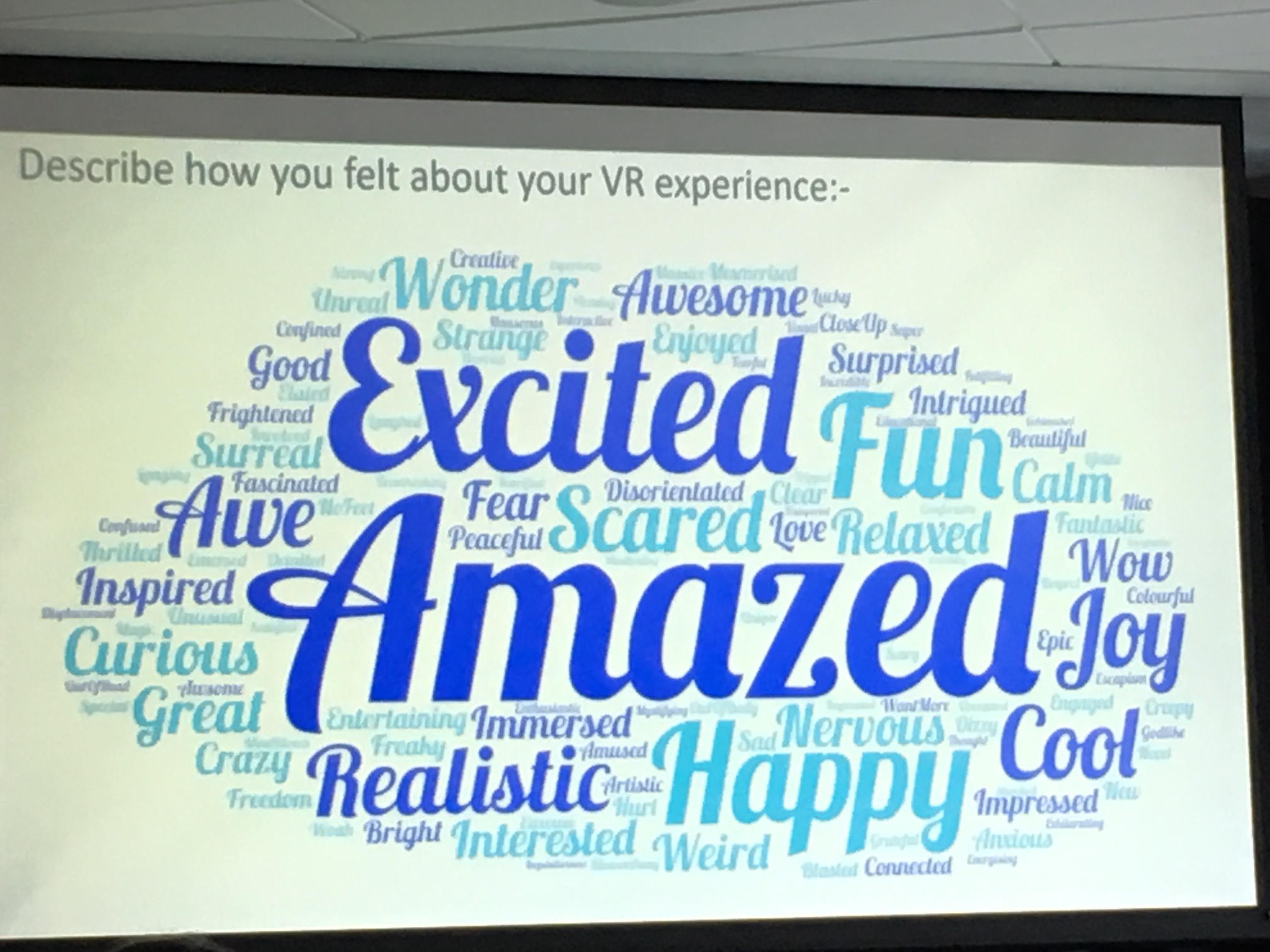
Burgess and Jowitt shared some of their journey with VR over the past year at the Puke Ariki Library. There was an overview of VR tech: Oculus Go and Quest are stand-alone headsets, platforms include Oculus, Steam VR, and Viveport Infinity. The latter has an annual subscription to 700+ titles model that they opted to go with. For Tech Week 2019, they chose three VR experiences to showcase (Dreams of Dali, Singularity, and the Blu). They needed to have ones that were largely intuitive because people would just be coming in and out and so there needed to be a low learning curve. They surveyed people who participated, and there were 102 respondents with demographics: 52% male, 48% female; 40% in age range 15 and under and a good percentage of people in the 25-54 age bracket; 42% had used VR before and 58% hadn’t. Most chose the Blu, but many were able to do the other ones if there were enough time. People said they liked the immersion and interactivity and escapism (VR gives a safe way to make mistakes).
They mentioned other benefits to using VR. There is the 3D Organon VR Anatomy and Medical Realities Platform that is being used in medical professionals’ training. There are experiences for the deaf and disabled and for migrant women. For example, Google Earth can be used by migrant women to travel back to their home town as well as show others where they came from. It can also be used to visit and scout out places before traveling. They said that content can be created in New Zealand too; New Zealand Geographic is shooting local footage in 8K that can be used for virtual experiences.
Their story of VR being used in a school and facilitating new connections between students was a positive example of the potential of VR in education. One girl who had been in the same class as another girl for a year but never talked to her was suddenly talking to her and laughing with her as they journeyed in the virtual world. In this case, the digital was actually a portal to real-life interactions, rather than closing people off.
He Tohu VR: Taking (virtual) archives to the people – Jared Davidson and Rene Burton
The National Library New Zealand He Tohu exhibit in Wellington is a permanent exhibition with three particularly significant documents: He Whakaputanga (the Declaration of Independence), Te Tiriti o Waitangi (the Treaty of Waitangi), and Te Petihana Whakamana Pōti Wahine (the 1893 Women’s Suffrage Petition). Since the documents were too fragile to travel, they decided to create a VR experience of the He Tohu exhibition and used the Unreal game engine (the promo video of the VR experience is available on YouTube). This format allows people to get closer to the documents than they could in real life with a glass cabinet in the way. In creating an educational experience for youth, they knew they wanted to contextualize the learning around the documents and have facilitation. A challenge in VR is that it is a very individual, one-on-one activity. The whole experience takes six minutes, which means the other students need to have things to do while taking turns with the VR. It can be very embodied, with students doing things like getting on the ground and trying to reach the top to look at various aspects of the documents.
Future GLAM Panel – Richard Foy, Honiana Love, Deb Verhoeven, Courtney Johnston, David Reeves, Mark Crookston, Migoto Eria
This panel featured people from a range of institutions and contexts. In discussing NDF as an organization and a conference, it was noted that there is a remarkable collegiality and a spirit of sharing that has stayed the same over the years. The inaugural meeting had similar themes to ones now, but that’s because systemic issues need to be worked on over a long time period. One potential issue is that there is less said about collaboration between institutions, who have more resources, than about individuals working with an institution, and it is not fair to always ask for communities to engage with the institutions. It was noted that people care about taonga, not which institution it belongs to, and what is needed is sharing of power and mana. We should be thinking about user-centered strategies and how they view things, rather than what works for the institution. Audiences are institutional omnivores, but meanwhile the government encourages rivalry between organizations via funding models. Interestingly, institutions seem to be able to collaborate on war exhibits (or other collaborations that some people may see as ‘pointless commemoration’) but not anything else! Successful collaboration is work that is better together, not just done separately.
There was discussion around issues of equity and diversity. Although commercial art galleries in Australia have almost achieved gender parity, government-funded ones have not, and the government is not being held accountable for this. Some libraries don’t use the Dewey Decimal System because local people want to find stuff in a way that works for them and their cultural understanding. It wouldn’t make sense to have Dewey’s system there. It was asked, how do we empower communities to speak for themselves and tell stories from their point of view? Even if we digitize materials, that’s still us doing things from our view. It is up to boards to be leading on these kinds of issues, but boards can be weak and represent their institutions’ interests rather than what they are supposed to represent: those of the communities they serve. Lip service isn’t good enough; every university has a mission statement with equity, but how many of them are accountable to taking real action. It was mentioned that funding may end up benefiting individuals over the greater community, meaning the impact of receiving funding is uncertain. For example, if an institution receives funding for someone to take a te reo course, that helps that person, but it doesn’t actually flow on to the community, though the hope is that it will in the long term. Regarding encouraging more Maori into the sector, it was mentioned that training models need to be changed; in one instance, getting iwi interns in has worked well because they can see what it’s like to work with the collections.